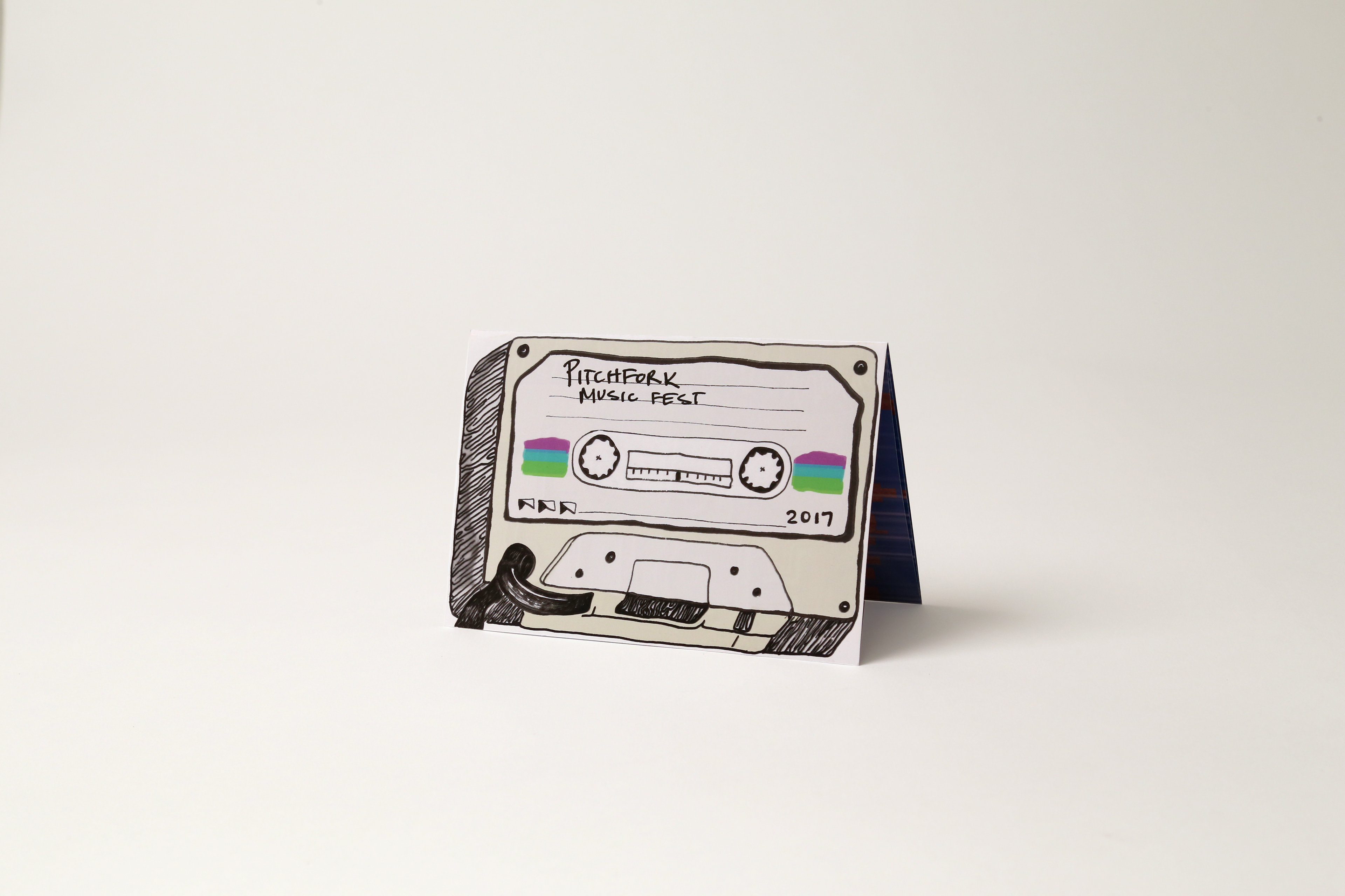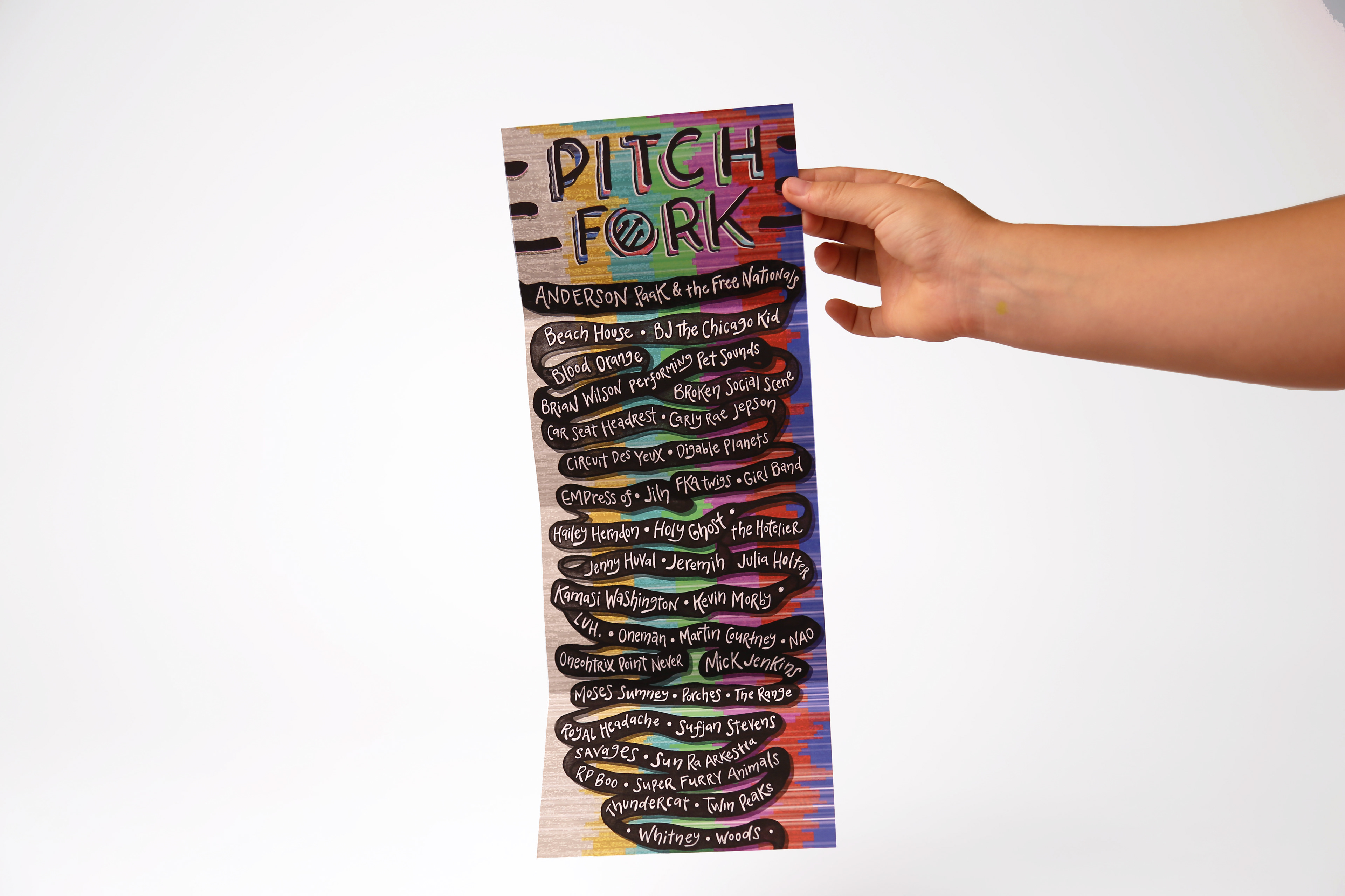
This redesign of pitchfork's 2017 mail out brochure was aimed at the idea of an unraveling cassette tape. Each fold reveals the set-list bit by bit, creating an experience when opening. The colors are nostalgic and goofy, reflecting the demographic of the festival.